reimagine Rebel


Project description
Rebel.com, a domain registration and web service provider, recognized it was time for a redesign that would better showcase its evolving brand and reflect the latest web design trends. They needed a fresh, modern look that didn’t just improve aesthetics but also connected with users on a deeper level.
My Role
As the primary designer, I led the redesign effort, focusing on revamping the visual identity, particularly for the public-facing sections. I collaborated with stakeholders to establish a new design direction, created a sitemap to organize content effectively, and reimagined the design elements for key pages.
Research and Inspiration
Competitive Analysis
I analyzed several competitor websites to gather insights into design trends and effective layout strategies.
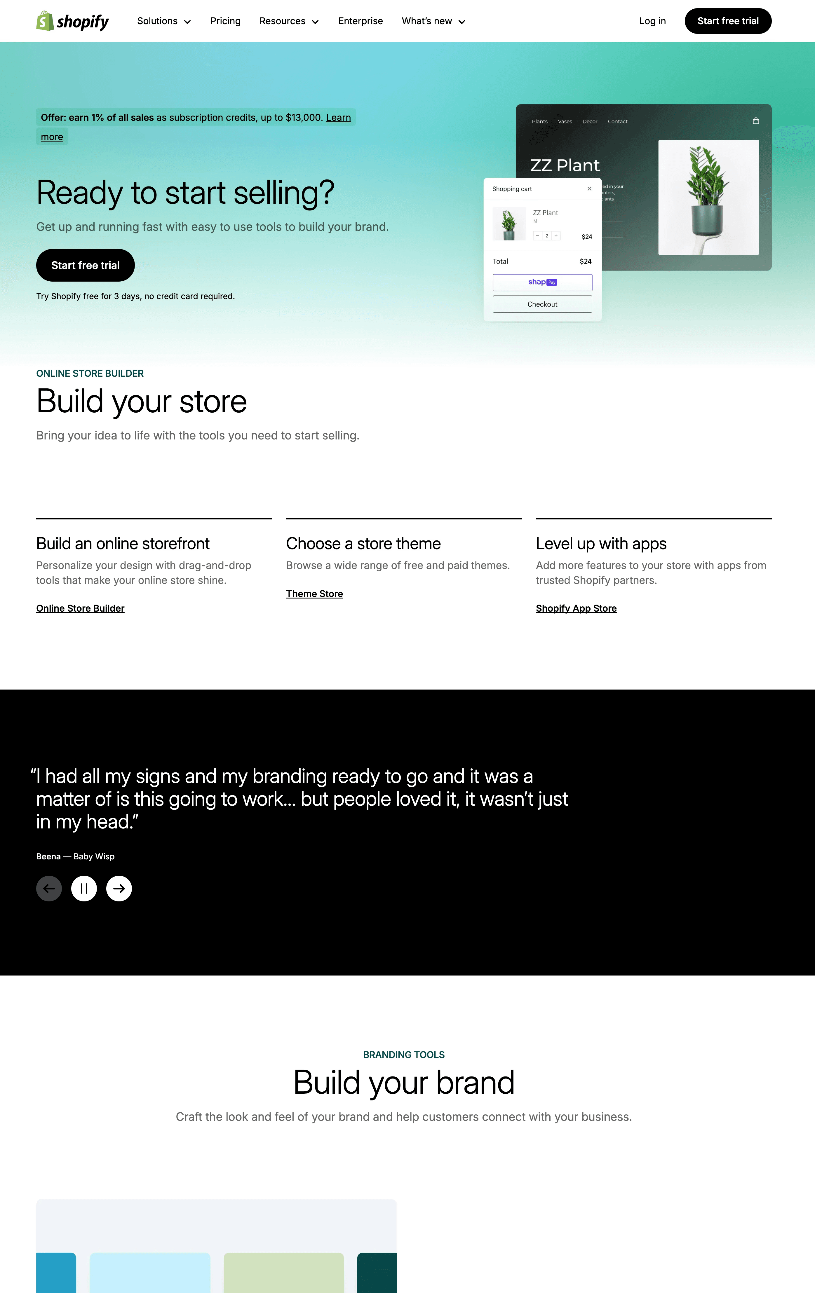
Shopify: Vibrant hero panels, clear call-to-actions, and dynamic content layouts.
DreamHost: Layered layouts with an emphasis on value propositions.
Key Takeaways
Bold and vibrant headers can capture user attention effectively.
Clear and early calls to action drive conversions.
Consistent and cohesive color schemes enhance brand identity.
Streamlined menu structures and intuitive navigation paths.

Sitemap and Content Organization
To clearly understand the existing site structure, I collaborated with the development team to gather a comprehensive list of pages.
I created a sitemap that accurately reflected the current content hierarchy using this information.
This sitemap was a foundation for identifying opportunities to improve usability and streamline navigation during the redesign process.

Key sections of the existing structure included:
Home Page: Focused on showcasing hero sections, featured services, and calls to action.
Hosting: Organized content to highlight core offerings with visual cohesion.
Domain Registration: Detailed sections for bargains, partnerships, and hero visuals.
Footer: Identified opportunities for restructuring in the design phase to enhance usability.
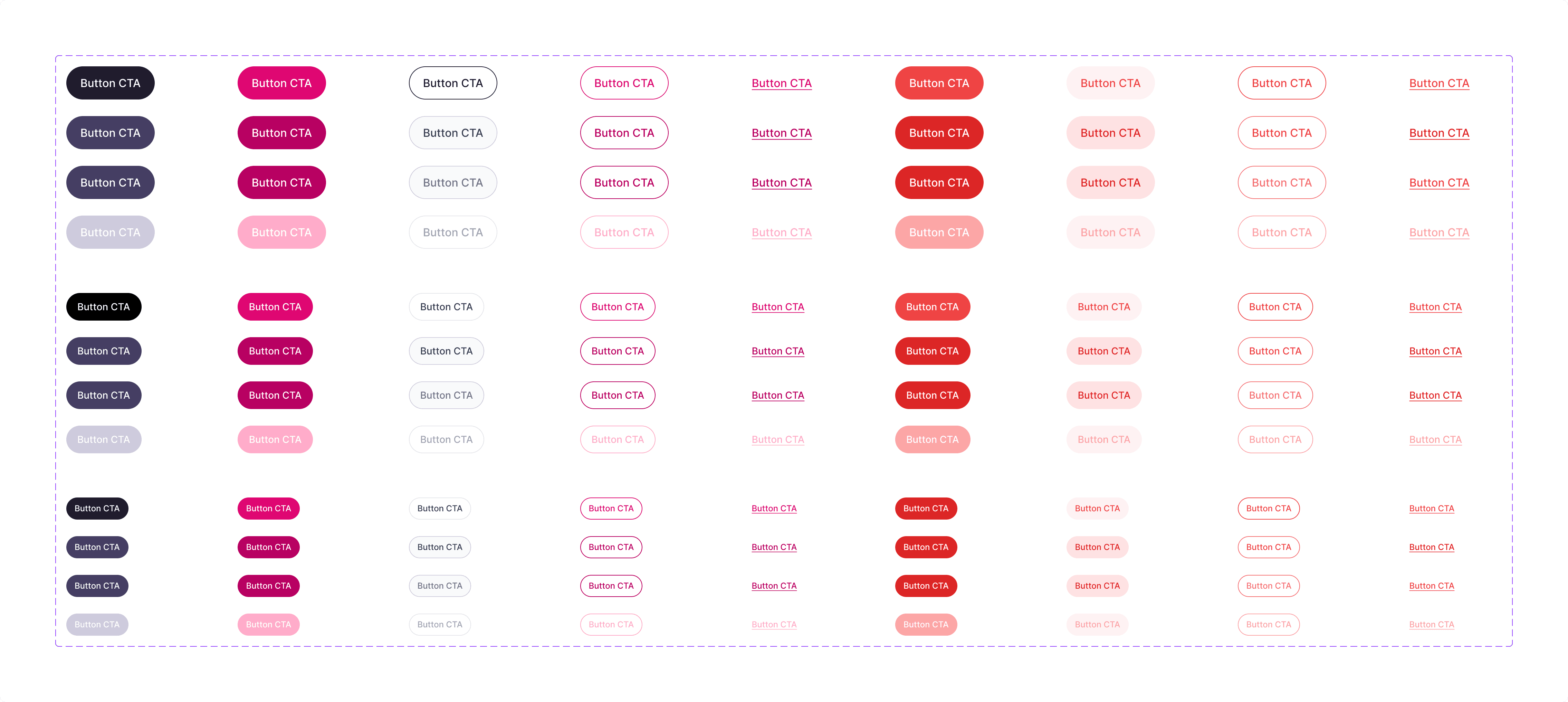
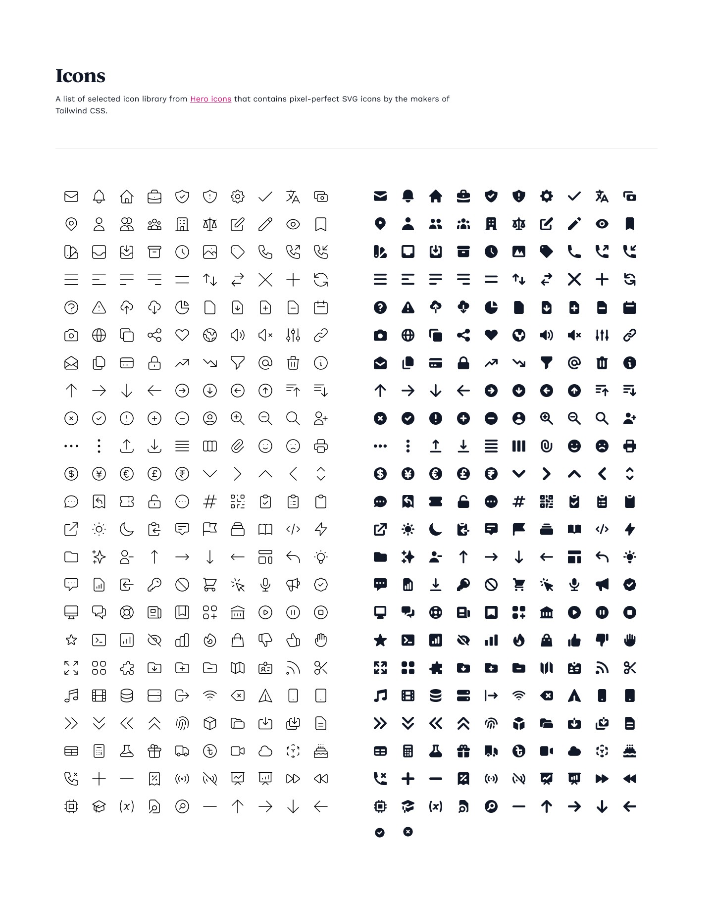
Brand Guideline
To maintain consistency across all touchpoints, I developed a brand guideline that established a unified visual language for Rebel.com.


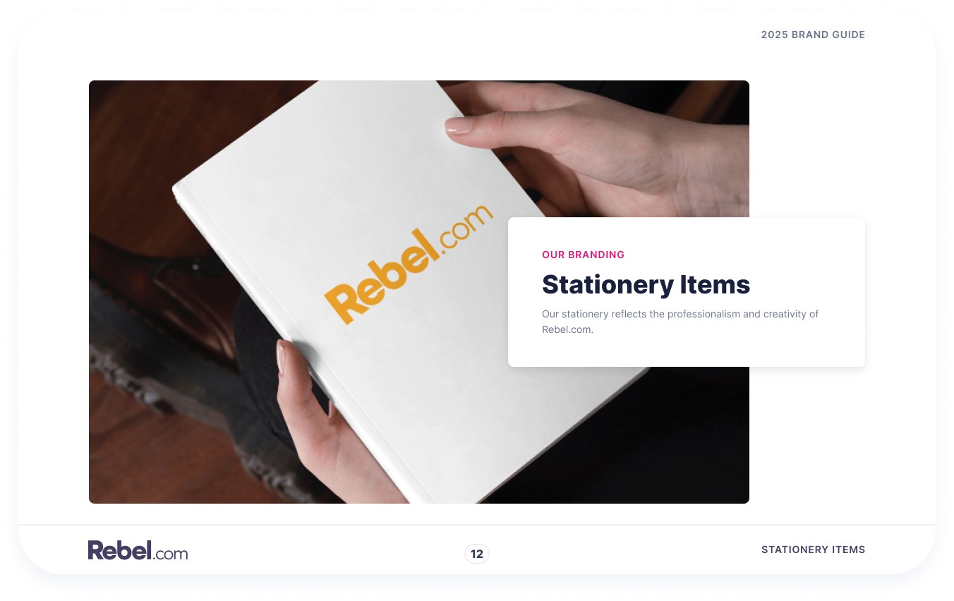


Updating Design System


Design Execution
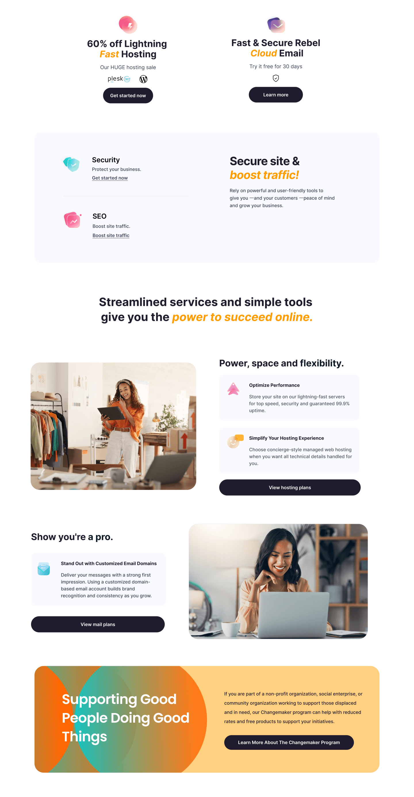
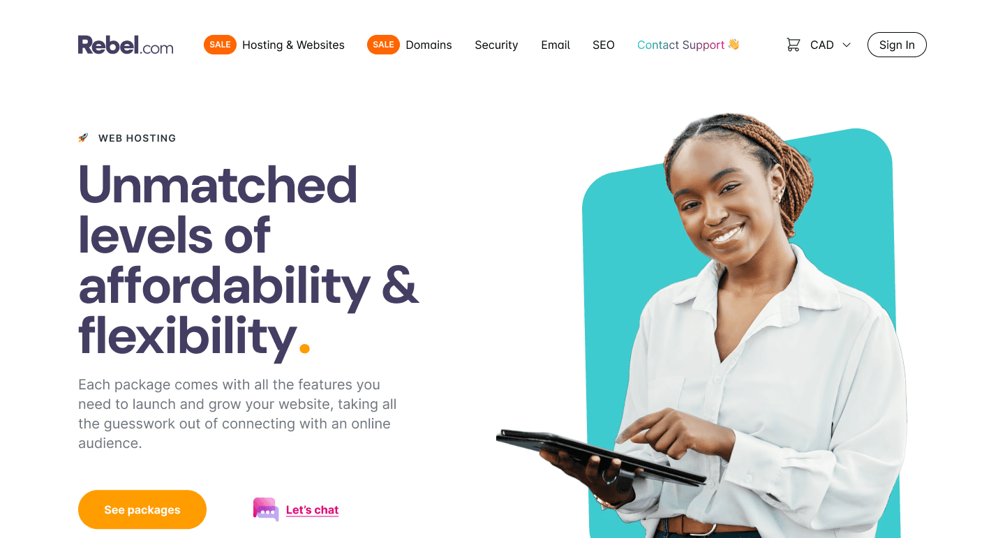
Home Page
Hero Block: Enlarged and positioned the hero block prominently to draw attention.
Search Functionality: Moved below the hero to improve visibility.
Feature Highlights: Consolidated services into cohesive panels with a modern color palette.


Domain Registration Page
Created bold hero visuals to highlight domain extensions and key offerings.
Enhanced visual appeal by updating icons, simplifying text, and refining layouts to make the section more engaging and customer-focused.


Hosting Page
Established a clearer and more cohesive color scheme.
Integrated a consistent style system for visual harmony.

Footer Section
Simplified Layout: Reduced the number of sections to avoid clutter and improve readability.
Enhanced Navigation: Grouped links logically, with clear headings for services, support, and company information.
Visual Cohesion: Incorporated the updated color palette and typography to ensure consistency with the rest of the site.
Call-to-Action: Added prominent contact and newsletter subscription options to drive engagement.
Outcomes
Throughout the project, I engaged stakeholders in review sessions, ensuring alignment with business goals and incorporating their feedback into iterative design updates.
Visual Appeal: The new design features bold, vibrant visuals, cohesive colors, and dynamic layouts that align with modern web aesthetics.
User Experience: Improved navigation and content organization provides a seamless browsing experience.
Brand Identity: The redesigned website reflects Rebel.com’s innovative and customer-focused ethos.


Feedback
Stakeholders were impressed with the clarity and cohesion of the design. The enhancements to the domain registration page such as modernized icons, streamlined text, and cleaner layouts received special praise for making the section visually appealing and easier to navigate.

Adam White
VP of Product Development
That's some really nice work. As an exercise, it's interesting to look at your design and then quickly look at the corresponding page that's currently live on our site. You can quickly tell how much of a glow-up this is.

Taryn Manias
Chief Marketing Officer
I love how the updated visuals and simplified text make everything feel more modern and accessible. It’s so user-friendly now.

Shawna Wilson
Customer Service Manager
Every section feels fresh and polished. The updates to the domain registration page really help it stand out.
Lessons Learned
This project reinforced the importance of balancing aesthetic considerations with functionality.
Conducting thorough competitive research and iterative design processes ensured the final product met user and business needs.
Future projects could benefit from integrating usability testing earlier to validate design decisions.