WEBSIte REDESIGN
Visual Redesign for ThisBusiness.sucks
Visual Redesign for ThisBusiness.sucks
Visual Redesign for ThisBusiness.sucks
ROLE
Web Design
Web Design
Web Design
EXPERTISE
Visual Design
Visual Design
Visual Design
YEAR
2022
2022
2022


Project description
Project description
Project description
ThisBusiness.sucks by Vox Populi registry Ltd empowers users to share candid feedback about businesses, fostering meaningful conversations around customer experience.
ThisBusiness.sucks by Vox Populi registry Ltd empowers users to share candid feedback about businesses, fostering meaningful conversations around customer experience.
My role in this project was to focus solely on the visual redesign of three key pages:
The home, awards, and winner info pages.
My role in this project was to focus solely on the visual redesign of three key pages:
The home, awards, and winner info pages.

Goals
Goals
Goals
I worked to ensure these pages maintained a bold, modern, and minimalistic look while amplifying the platform's unique voice. The brand’s provocative and edgy nature provided an exciting opportunity to create a design that balances boldness with professionalism, making it approachable to a wide audience. My primary goals were to:
I worked to ensure these pages maintained a bold, modern, and minimalistic look while amplifying the platform's unique voice. The brand’s provocative and edgy nature provided an exciting opportunity to create a design that balances boldness with professionalism, making it approachable to a wide audience. My primary goals were to:
Reinforce
Reinforce
Use design elements to reinforce the platform's mission of empowering consumer voices.
Reinforce
Use design elements to reinforce the platform's mission of empowering consumer voices.
Optimize
Optimize
Create a clean, intuitive layout that prioritizes readability and usability.
Optimize
Create a clean, intuitive layout that prioritizes readability and usability.
Balance
Balance
Convey the brand’s bold personality while maintaining credibility.
Balance
Convey the brand’s bold personality while maintaining credibility.
I worked within the brand’s established color palette of pink, blue, and yellow, using these colors strategically to maintain a fresh, cohesive look while incorporating ample white space for clarity and openness.
I worked within the brand’s established color palette of pink, blue, and yellow, using these colors strategically to maintain a fresh, cohesive look while incorporating ample white space for clarity and openness.
Approach
Approach
Approach
I started by creating wireframes for the homepage, awards page, and winner information page.
I started by creating wireframes for the homepage, awards page, and winner information page.
The wireframes provided clarity and ensured that all key elements were appropriately placed before moving into the detailed design phase.
The wireframes provided clarity and ensured that all key elements were appropriately placed before moving into the detailed design phase.
Quick WIREFRAMES
Define the structure and layout for each page.
Visualize content hierarchy and navigation flows.
Collaborate with stakeholders to gather feedback early in the design process.
Define the structure and layout for each page.
Visualize content hierarchy and navigation flows.
Collaborate with stakeholders to gather feedback early in the design process.


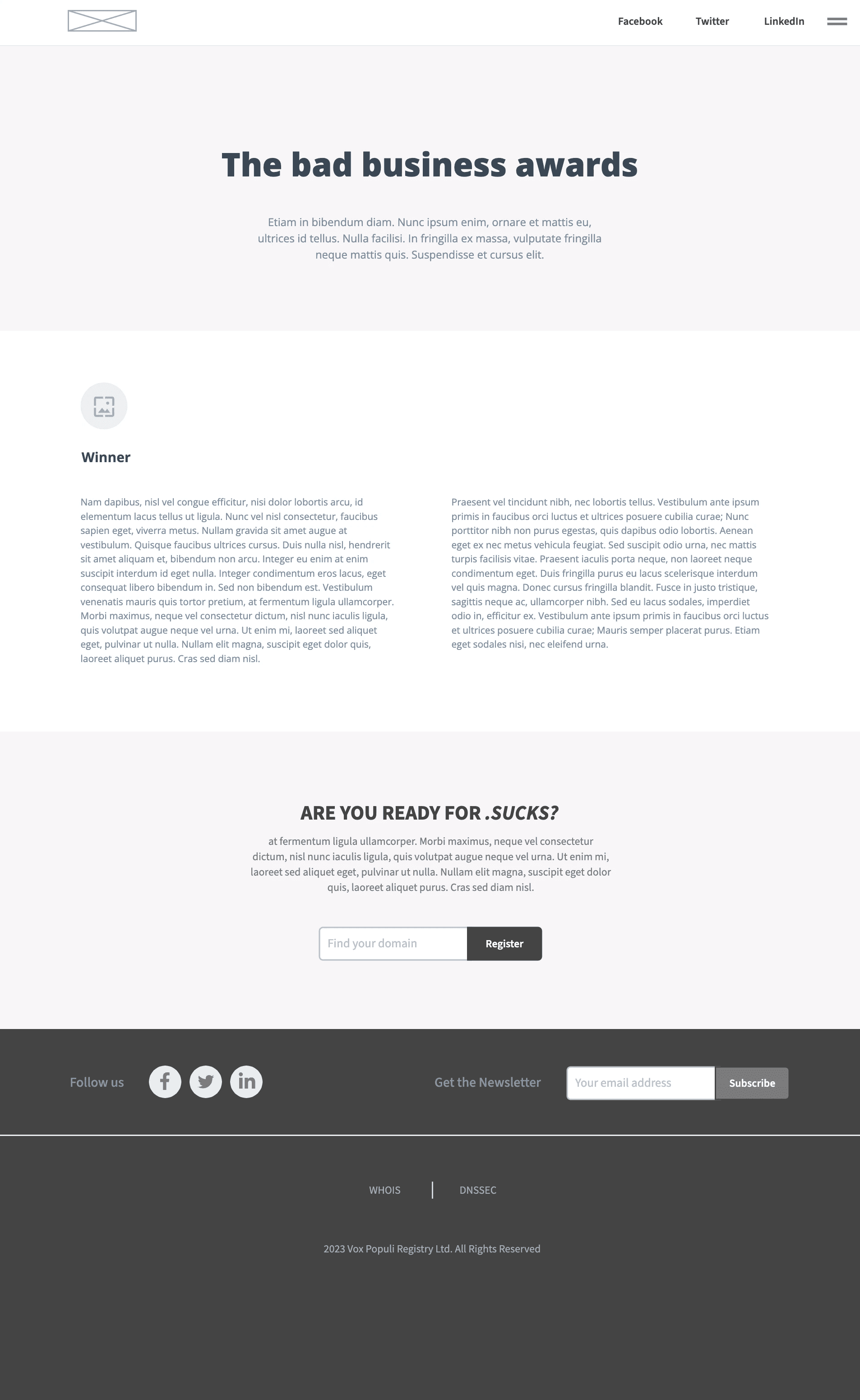
Refining Designs
Once the low-fidelity wireframes were approved, I transitioned to more detailed wireframe designs in Figma. This structured approach ensured a smooth transition from concept to implementation, minimizing revisions, and maintaining focus on the project’s objectives.
Once the low-fidelity wireframes were approved, I transitioned to more detailed wireframe designs in Figma. This structured approach ensured a smooth transition from concept to implementation, minimizing revisions, and maintaining focus on the project’s objectives.

Home Page
Home Page
Home Page
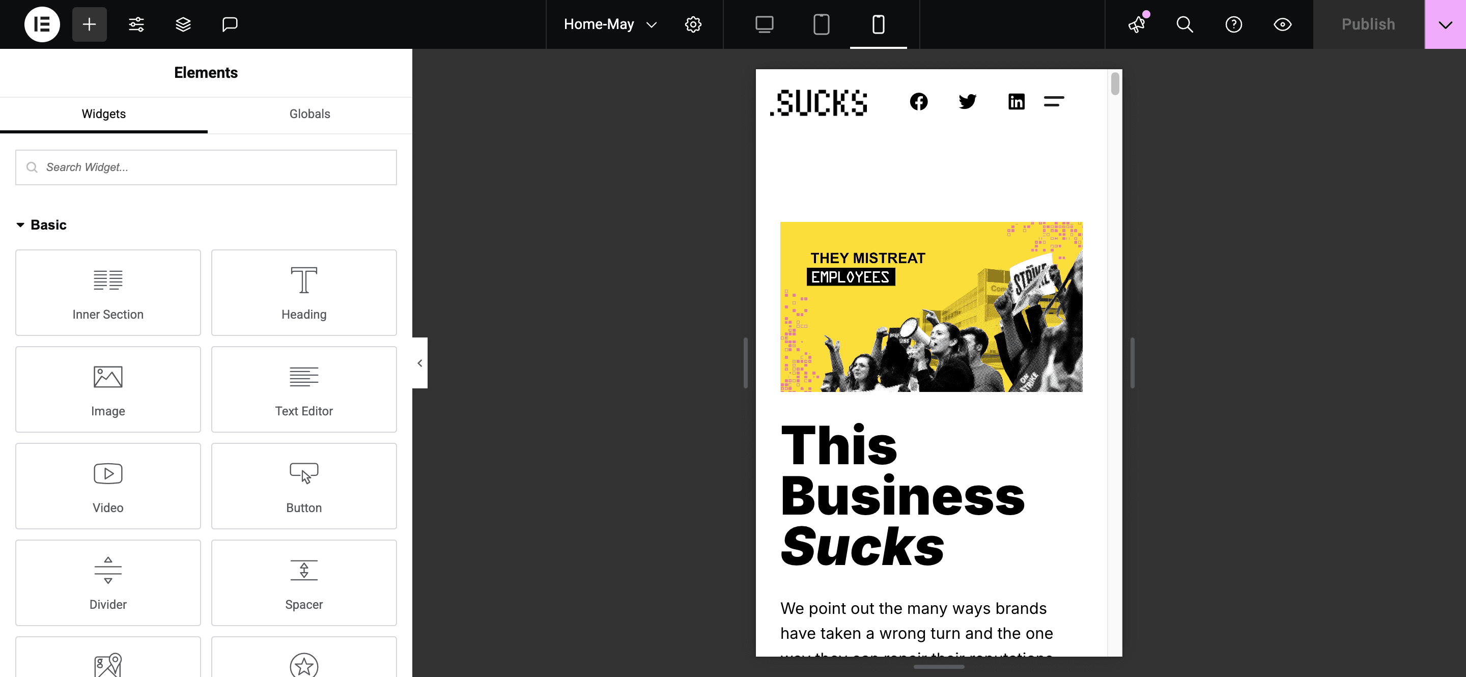
Developing the Visual Style
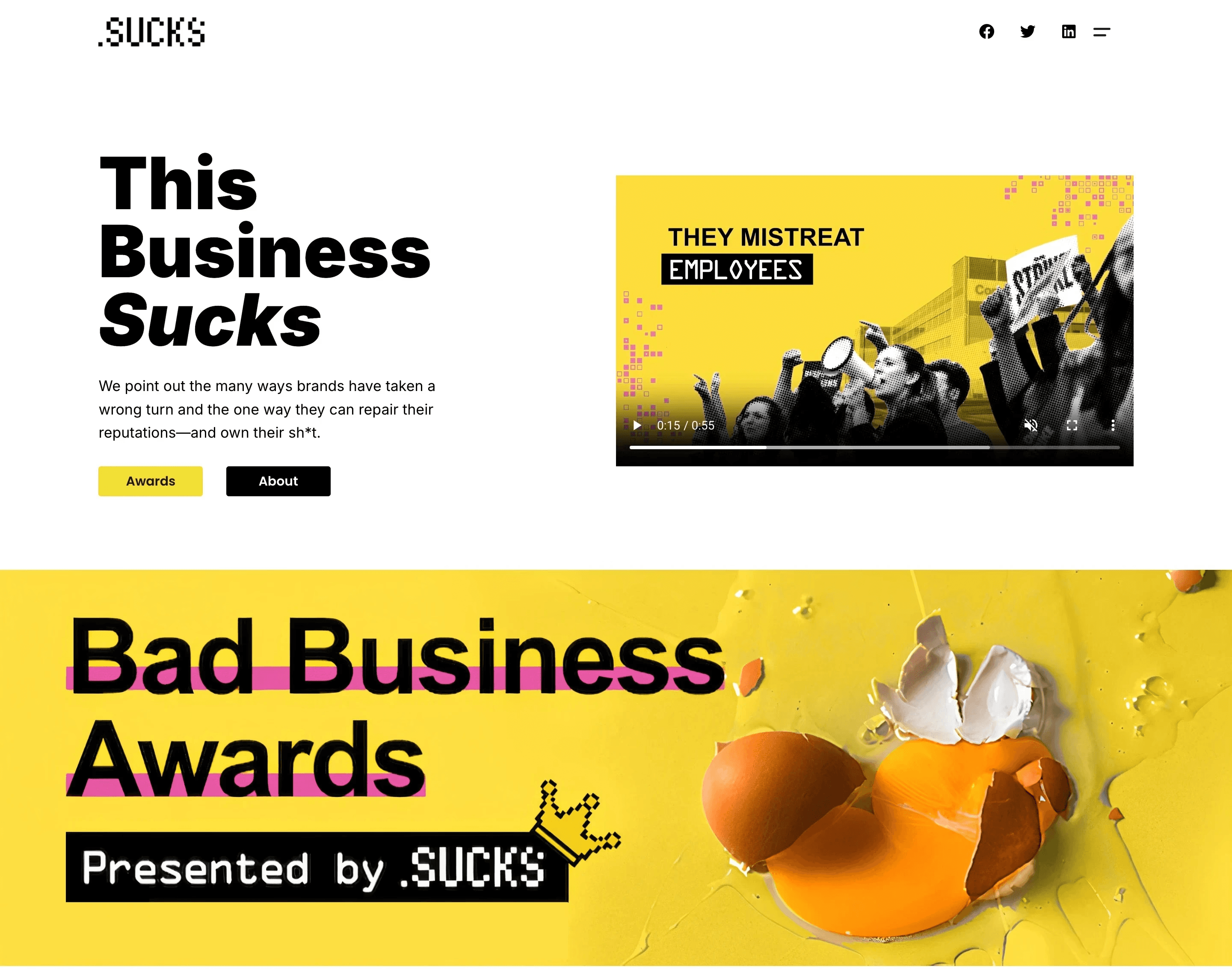
The homepage was designed to make an immediate impact while guiding users to take action.
The homepage was designed to make an immediate impact while guiding users to take action.
Color Palette: A mix of black, white, and bold accent colors. Bright tones were used sparingly to ensure the design felt clean and modern.
Typography: Bold sans-serif fonts for headlines to convey confidence and clarity, paired with lighter weights for body text to enhance readability.
Color Palette: A mix of black, white, and bold accent colors. Bright tones were used sparingly to ensure the design felt clean and modern.
Typography: Bold sans-serif fonts for headlines to convey confidence and clarity, paired with lighter weights for body text to enhance readability.

DotSucks Stakeholder Feedback
DotSucks Stakeholder Feedback
DotSucks Stakeholder Feedback
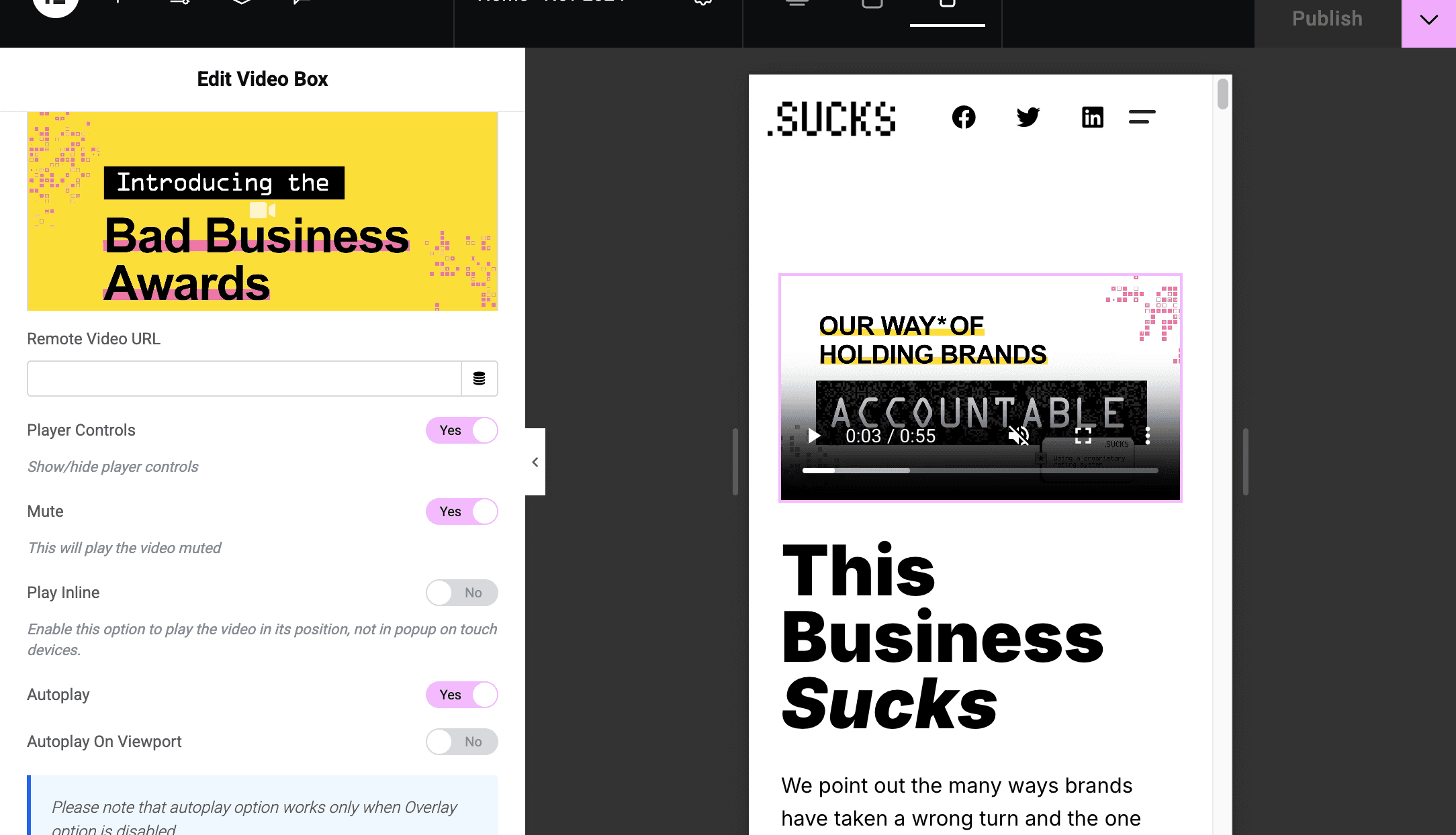
Hero Section: Initially, I used an image in the hero section, but the DotSucks CEO was concerned the visual wasn't engaging enough
Hero Section: Initially, I used an image in the hero section, but the DotSucks CEO was concerned the visual wasn't engaging enough
"The hero image looks nice, but it feels a bit static. Could we explore something more engaging, to better capture the excitement and energy of the Bad Business Awards?"
"The hero image looks nice, but it feels a bit static. Could we explore something more engaging, to better capture the excitement and energy of the Bad Business Awards?"
Solution
Solution
I switched to a video introducing the Bad Business Awards. The video added energy and better communicated the dynamic nature of the awards.
I switched to a video introducing the Bad Business Awards. The video added energy and better communicated the dynamic nature of the awards.
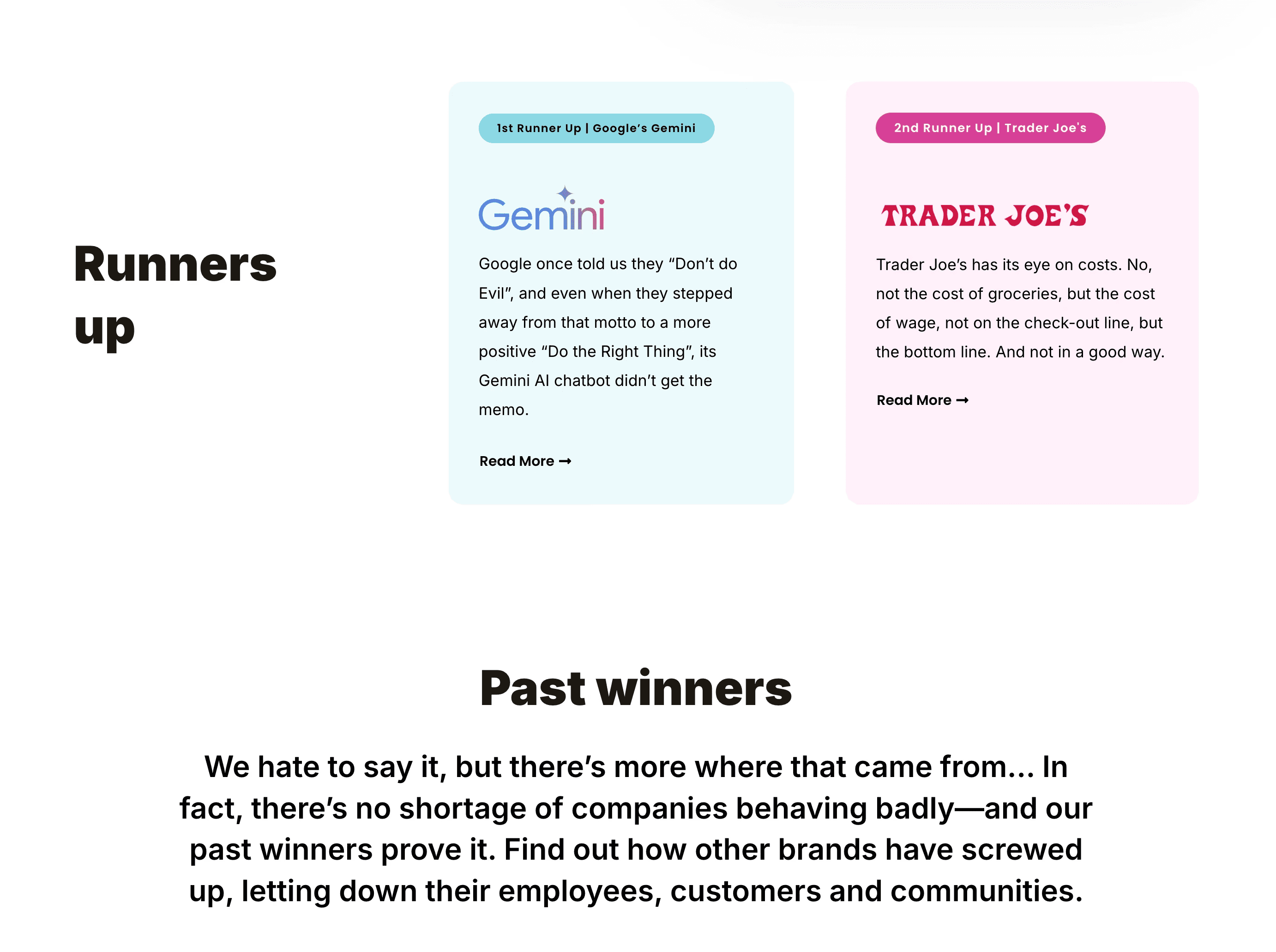
Runners-up Section: Stakeholders felt the runner-up section initially lacked distinction between the two businesses
Runners-up Section: Stakeholders felt the runner-up section initially lacked distinction between the two businesses
"The runner-up section feels a little flat. There’s not enough visual distinction between the two businesses. Can we find a way to make them stand out more individually?"
"The runner-up section feels a little flat. There’s not enough visual distinction between the two businesses. Can we find a way to make them stand out more individually?"
Solution
Solution
Applied lighter tones of pink and blue to each runner-up's section, creating subtle differentiation.
Adjusted the layout to ensure the badges and text didn’t compete visually, using consistent alignment and spacing.
Applied lighter tones of pink and blue to each runner-up's section, creating subtle differentiation.
Adjusted the layout to ensure the badges and text didn’t compete visually, using consistent alignment and spacing.
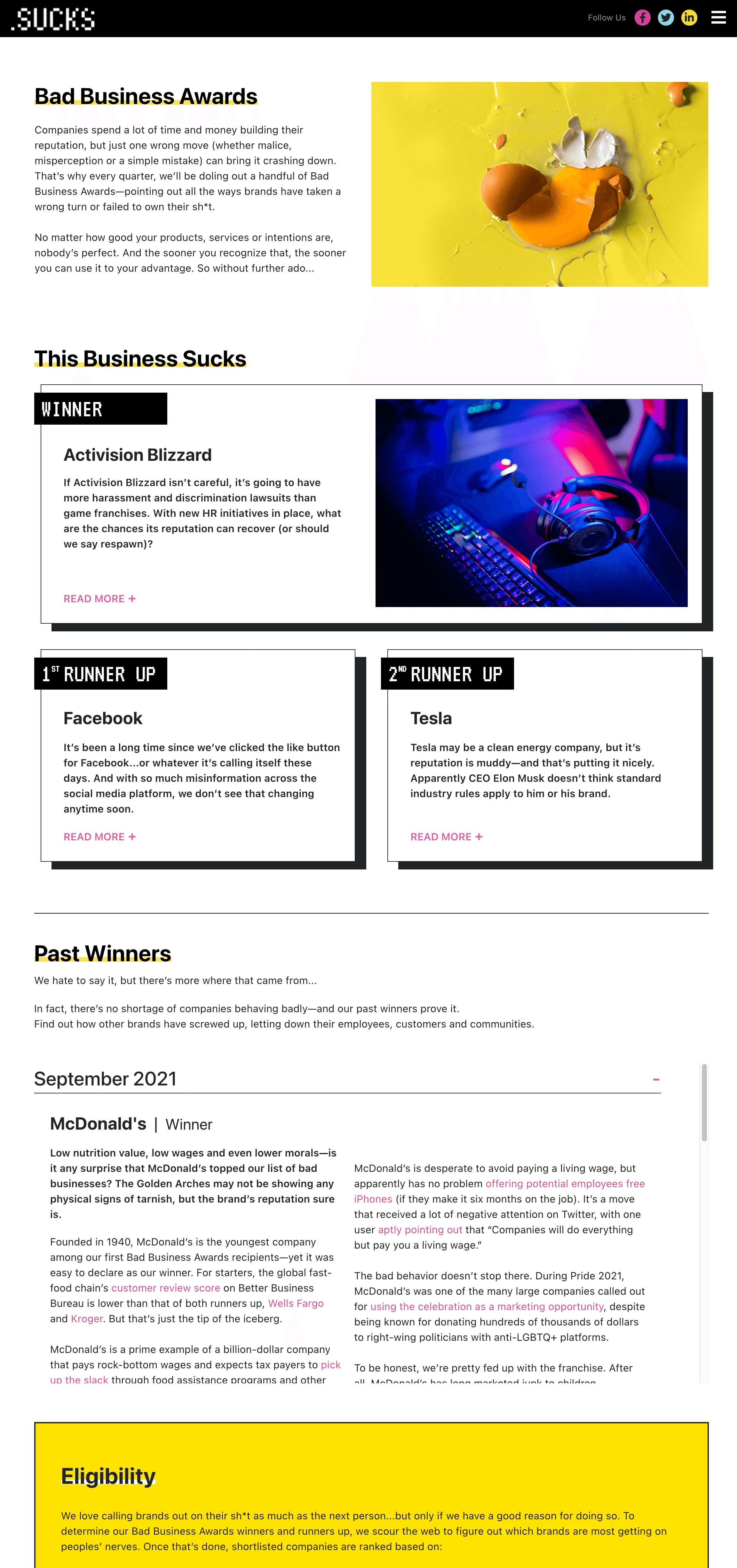
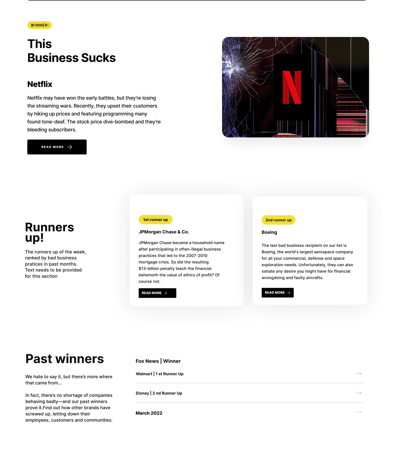
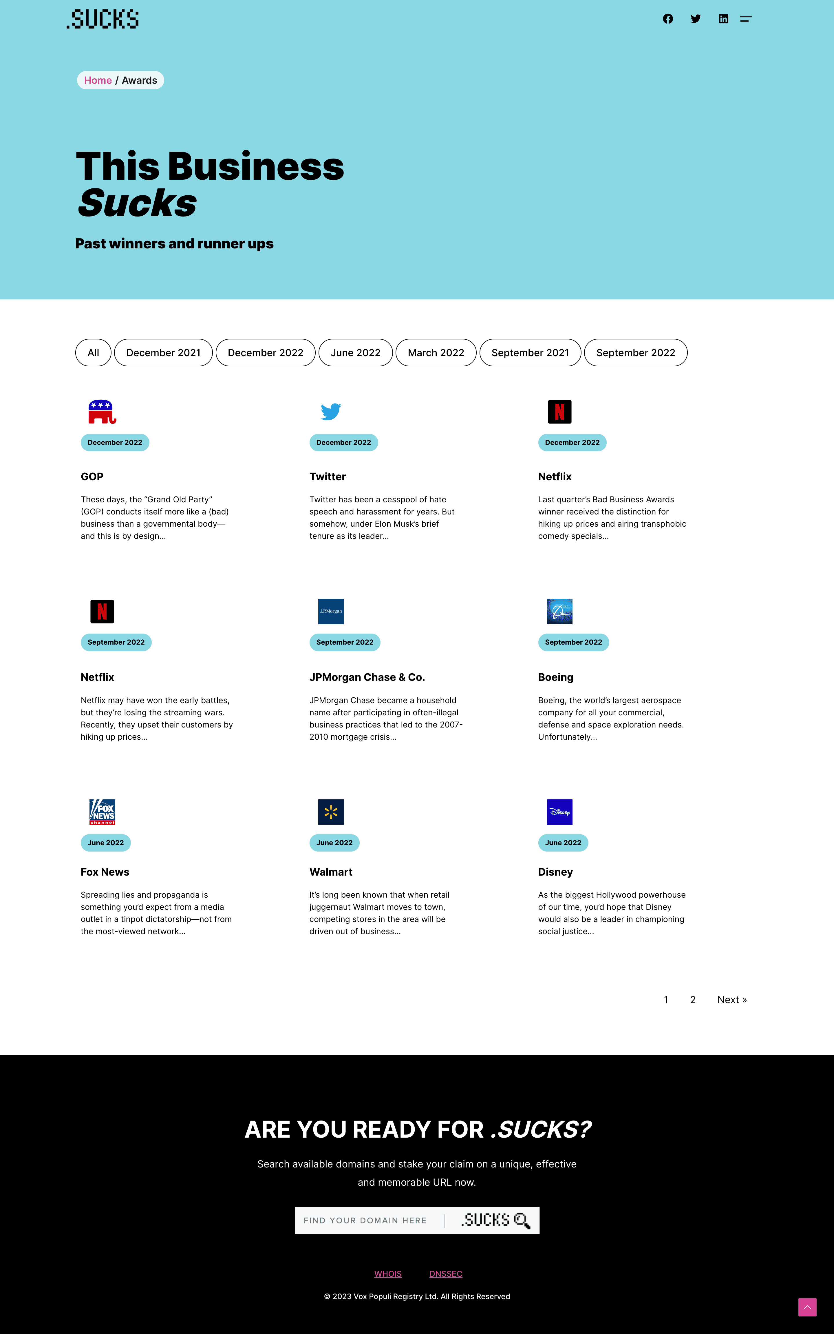
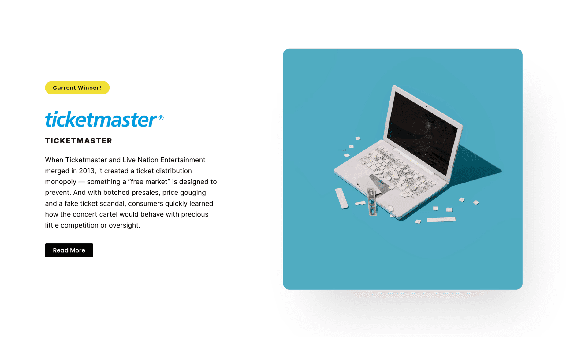
Inner Pages: Bad Business Awards
Inner Pages: Bad Business Awards
Inner Pages: Bad Business Awards
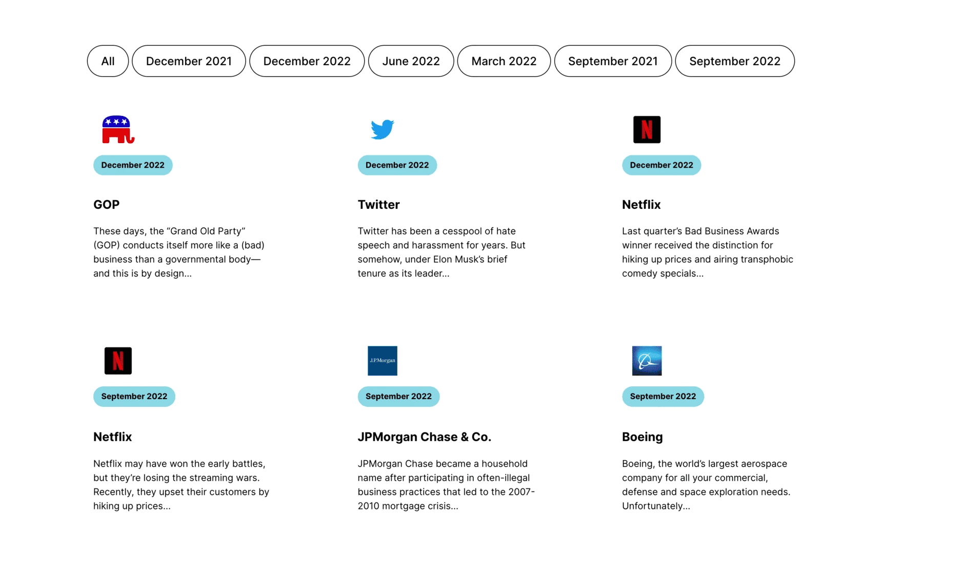
The Awards page was redesigned to showcase the winners and runner-ups in an engaging and scannable format
The Awards page was redesigned to showcase the winners and runner-ups in an engaging and scannable format
The winners and runner-ups were organized using a three-column grid layout. Each was displayed with its logo, title, and concise supporting information.
The winners and runner-ups were organized using a three-column grid layout. Each was displayed with its logo, title, and concise supporting information.
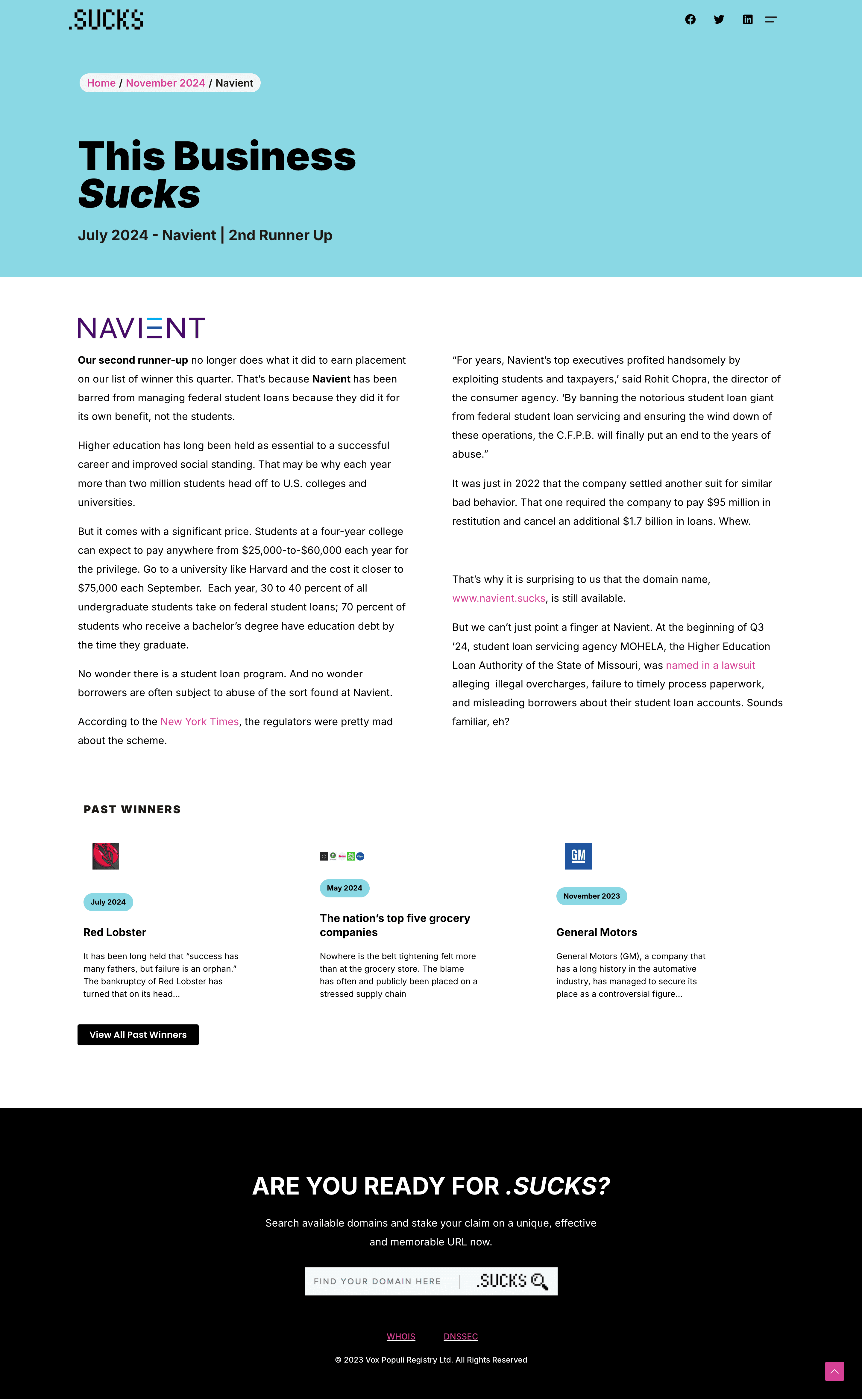
Each grid item was clickable, allowing users to explore more details.
I incorporated a breadcrumb trail at the top of the page. This allowed users to easily track their location within the site, providing a clear path back to previous pages.
Each grid item was clickable, allowing users to explore more details.
I incorporated a breadcrumb trail at the top of the page. This allowed users to easily track their location within the site, providing a clear path back to previous pages.
WordPress Implementation
WordPress Implementation
WordPress Implementation
Theme Customization: I customized a WordPress theme to reflect the brand’s bold and modern aesthetic while maintaining functionality.
Theme Customization: I customized a WordPress theme to reflect the brand’s bold and modern aesthetic while maintaining functionality.
Grid Layout Integration: I used plugins to implement the 3-column grid for the awards page, ensuring the design was both visually appealing and easy to update.
Grid Layout Integration: I used plugins to implement the 3-column grid for the awards page, ensuring the design was both visually appealing and easy to update.
Responsive Design: I optimized the site for desktop, tablet, and mobile devices, ensuring a seamless experience across platforms.
Responsive Design: I optimized the site for desktop, tablet, and mobile devices, ensuring a seamless experience across platforms.
Performance Optimization: The hero video was embedded using lightweight plugins, and page elements were optimized to ensure fast loading times.
Performance Optimization: The hero video was embedded using lightweight plugins, and page elements were optimized to ensure fast loading times.

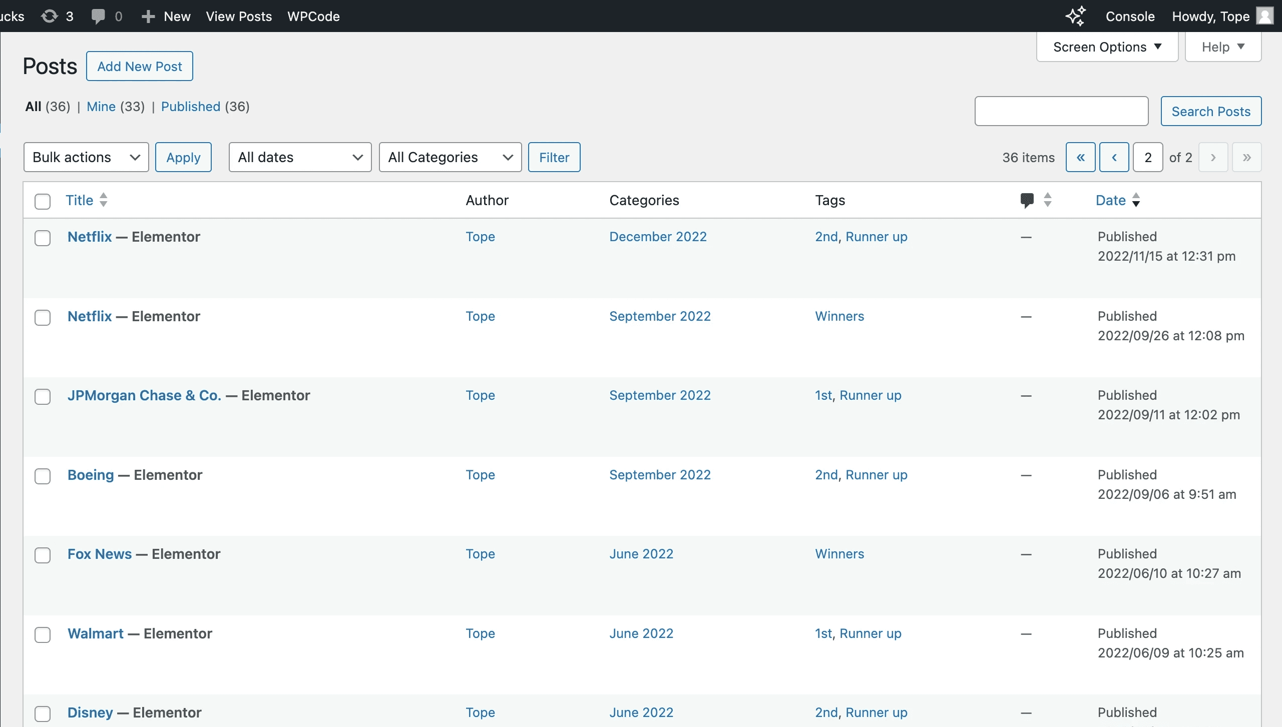
Content Management: Using WordPress's post system, I structured the awards data into posts categorized by dates (e.g., year of the awards) and tagged as "Winner" or "Runner-Up." This approach ensured that businesses were easily sortable by their award status and the year they participated.
Content Management: Using WordPress's post system, I structured the awards data into posts categorized by dates (e.g., year of the awards) and tagged as "Winner" or "Runner-Up." This approach ensured that businesses were easily sortable by their award status and the year they participated.
Future Updates: By leveraging WordPress's native functionalities, adding new winners or runner-ups required minimal effort. The scalable structure allowed for seamless updates, ensuring the awards page remains organized and relevant for future iterations.
Future Updates: By leveraging WordPress's native functionalities, adding new winners or runner-ups required minimal effort. The scalable structure allowed for seamless updates, ensuring the awards page remains organized and relevant for future iterations.

Outcomes
Outcomes
Outcomes
Clear and Intuitive Layouts: Thoughtful spacing and hierarchy ensured a seamless user experience, allowing users to focus on the content.
Engaging Experience: The use of a video in the hero section and clickable logos on the awards page added energy and interactivity to the design.
Clear and Intuitive Layouts: Thoughtful spacing and hierarchy ensured a seamless user experience, allowing users to focus on the content.
Engaging Experience: The use of a video in the hero section and clickable logos on the awards page added energy and interactivity to the design.


Reflection
Reflection
Reflection
This project was an exciting opportunity to blend creativity with strategy, delivering a design that aligned with a bold and distinctive brand. It reinforced the importance of collaboration and adaptability in the design process, from gathering stakeholder feedback to optimizing the final implementation in WordPress.
For future iterations, I’d explore adding more interactive elements, such as data visualizations or live metrics for trending topics, to further engage users and keep the platform dynamic.
© 2024 – Temi Lona
© 2024 – Temi Lona
© 2024 – Temi Lona